comparison
Best NFL Hawaiian Shirts by Team Design: 2026 Rankings
May
Not all NFL team colors translate equally well into the all-over print Hawaiian shirt format. This 2026 ranking compares all 32 NFL teams by color identity, distance recognition, tropical design fit, and print visibility. Some teams have palettes that feel built for Hawaiian shirts; others need stronger logo placement and design execution to avoid looking generic from across a bar. The rankings below reflect those differences honestly — including the teams where the format works best, the teams that depend more heavily on execution, and the teams where color identity presents real design constraints.
Quick Navigation
- Ranking Criteria
- Full 32-Team Rankings
- S-Tier Teams
- A-Tier Teams
- B-Tier Teams
- C-Tier Teams
- Best Picks by Use Case
- What the Rankings Mean
- Frequently Asked Questions
The Ranking Criteria
Four factors determine how well a team’s Hawaiian shirt design works, and they’re weighted differently depending on the use case. Color identity strength is the most important single factor — if someone can identify the team from across a room without reading a logo, the design is doing its job. A Miami Dolphins shirt in aqua and orange should read as Dolphins instantly; a generic dark jersey-style shirt that requires close inspection to identify the team misses the point of the format. Design coherence is whether the tropical pattern and the team branding feel like a unified garment rather than two separate design choices applied to the same fabric. Print quality on the specific color matters because some NFL team colors — particularly metallics, specific shades of green, and certain blues — are harder to reproduce accurately in sublimation printing than others. Fan recognition is the practical test: would other fans of this team immediately recognize the shirt as theirs, and would non-fans recognize the team?
S-Tier teams have color palettes that usually work well in the Hawaiian shirt format with minimal design support. A-Tier teams have strong identities but require accurate color execution. B-Tier teams can look excellent with the right pattern balance, logo placement, or accent color usage. C-Tier teams are still wearable and can produce good shirts, but they depend more heavily on design execution to create clear team identity from a distance.
How to Read This Ranking
The tiers reflect one specific question: how well does this team’s color palette leverage the all-over print Hawaiian shirt format on its own terms? A higher tier means the colors do more of the work — you could identify the team from across a bar before reading a single word or inspecting a logo. A lower tier doesn’t mean the shirts are bad; it means design execution carries more weight than color identity alone. Fans of C-Tier teams often have perfectly strong Hawaiian shirt designs — they just depend more on pattern specificity, logo placement, and color accuracy to achieve the same recognition that S-Tier colors deliver by default. All 32 NFL teams are represented in the collection.
The Full Rankings: All 32 NFL Teams
| Tier | Team | Colors | Why it works (or doesn’t) |
|---|---|---|---|
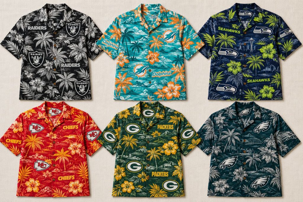
| S | Las Vegas Raiders | Silver & black | Highest contrast — instantly identifiable |
| S | Miami Dolphins | Aqua & orange | Most tropical-native palette in NFL |
| S | Seattle Seahawks | Navy & action green | Action green accent creates strong visual pop |
| S | Kansas City Chiefs | Red & gold | Warm high-visibility combination |
| A | Green Bay Packers | Green & gold | Historic identity, strong when color is accurate |
| A | Philadelphia Eagles | Midnight green & silver | Distinctive shade — strong when accurate, weak when off |
| A | Dallas Cowboys | Navy & silver | Major brand recognition, clean high contrast |
| A | Pittsburgh Steelers | Black & gold | Highly distinctive — very little overlap in NFL |
| B | Denver Broncos | Navy & orange | Vivid orange accent creates strong visibility |
| B | Los Angeles Chargers | Powder blue & gold | Distinctive powder blue — tropical and retro feel |
| B | Minnesota Vikings | Purple & gold | Purple is a rare primary — visually distinct |
| B | Baltimore Ravens | Purple, black & gold | Purple distinctive, gold essential for visual energy |
| B | Jacksonville Jaguars | Teal, black & gold | Teal reads as team-specific — works with tropical elements |
| B | New York Jets | Gotham green & white | Distinctive green when color is accurate |
| B | Carolina Panthers | Black, blue & silver | Cool modern palette — blue needs prominence |
| B | Tampa Bay Buccaneers | Red, pewter & white | Red primary works — pewter accent is unusual |
| B | Atlanta Falcons | Black & red | High contrast — aggressive and visible |
| B | New England Patriots | Navy, red & silver | Crowded color space — logo carries more weight |
| B | Chicago Bears | Navy & orange | Orange accent strong when used prominently |
| B | San Francisco 49ers | Scarlet & gold | Warm cohesive palette, regional identity signal |
| B | New Orleans Saints | Black & gold | Fleur-de-lis gives black-and-gold designs team specificity |
| B | Cleveland Browns | Brown & orange | Highly distinctive palette, aesthetic execution matters |
| B | Cincinnati Bengals | Black, orange & white | Tiger stripe pattern works especially well in all-over print |
| C | New York Giants | Royal blue & red | Crowded NFL color space — logo specificity required |
| C | Washington Commanders | Burgundy & gold | Burgundy is rare — distinctive when executed well |
| C | Arizona Cardinals | Cardinal red & white | Red primary works, white secondary needs care |
| C | Los Angeles Rams | Royal blue & gold | Gold accent helps — logo shape anchors identity |
| C | Detroit Lions | Honolulu blue & silver | Lighter blue — print accuracy more critical |
| C | Indianapolis Colts | Royal blue & white | White as primary reads as negative space in all-over print |
| C | Buffalo Bills | Red, white & royal blue | Patriotic palette shared with several teams |
| C | Tennessee Titans | Navy & Columbia blue | Lighter blue needs accurate execution |
| C | Houston Texans | Deep steel blue & red | Clean modern palette — bull logo anchors identity |
S-Tier: Teams Where the Format Works Best
These teams have color identities strong enough that the all-over print format adds visual power rather than requiring the viewer to squint at a logo. Their Hawaiian shirts are among the strongest in the collection because the colors carry the identity before the design elements even register.
The Las Vegas Raiders silver and black combination is among the most visually dramatic in the NFL, and it translates into the all-over print format with an authority that few other teams match. The high contrast between silver and black creates designs that are immediately identifiable and visually striking in a way that lower-contrast combinations can’t replicate. The Raiders all-over print reads as Raiders from across a room without any additional context. If you want the strongest visual impact for game day, the Raiders collection is one of the safest picks for instant team recognition. Browse the Raiders Hawaiian shirt collection.

The Miami Dolphins aqua and orange combination is arguably the most tropical-native color palette in professional football — a team whose primary colors happen to align closely with the warm-weather, beach-culture aesthetic that the Hawaiian shirt format was built around. The aqua reads as distinctly Dolphins rather than generic teal, and the orange accent creates contrast that makes designs visually dynamic. A Dolphins Hawaiian shirt in aqua and orange doesn’t require the viewer to know the team logo to understand what they’re looking at. Browse the Dolphins Hawaiian shirt collection.
The Seattle Seahawks College Navy and Action Green combination is one of the more visually aggressive color pairings in the NFL, and it works specifically well in the all-over print format because the Action Green accent creates contrast that pops against the navy base. The Seahawks have one of the stronger color identities in the NFC, and the Hawaiian shirt format leverages that identity effectively. Browse the Seahawks Hawaiian shirt collection.
The Kansas City Chiefs red and gold combination has the advantage of being one of the most visible color pairings in professional sports — red as a primary with gold as an accent creates warm, high-energy designs that read clearly as Chiefs at a distance. The Chiefs’ championship-era visibility has also made their colors highly recognizable beyond their core fanbase, which increases the identity signal value of the all-over print format specifically. Browse the Chiefs Hawaiian shirt collection.
A-Tier: Strong Color Identity, Solid Design Execution
These teams have recognizable color identities that work well in the all-over print format, with some caveats on specific design executions that affect where they land relative to the S-Tier teams.
The Green Bay Packers green and gold is one of the most historically recognizable color combinations in professional football, and it translates well into the Hawaiian shirt format. The specific challenge for Packers designs is color accuracy — Packers green is a precise shade that fans notice immediately when it’s off, and designs that drift toward generic dark green or forest green lose the identity signal. When the green is right, Packers Hawaiian shirts in the A-Tier earn their place because the color combination is distinctive and the gold accent creates visual warmth that works well with tropical design elements. Browse the Packers Hawaiian shirt collection.
The Philadelphia Eagles midnight green and silver combination has strong visual identity but presents specific print accuracy challenges. Midnight green is a precise color that Eagles fans will immediately correct if it drifts toward teal, dark green, or forest green — the specific post-1996 shade is meaningful to the fanbase in a way that makes color accuracy more important here than for teams with more forgiving palettes. When the midnight green is accurate, Eagles designs work well; when it’s off, they lose the identity signal that makes the format valuable. Browse the Eagles Hawaiian shirt collection.
The Dallas Cowboys navy and silver combination is one of the most widely recognized in professional sports — the Cowboys star in navy and silver is identifiable well beyond the NFL fanbase. The navy base with silver accents creates clean, high-contrast designs that read clearly as Cowboys. The Cowboys’ national brand recognition means these designs have identity signal value even for non-football fans who recognize the star and the color combination. Browse the Cowboys Hawaiian shirt collection.
The Pittsburgh Steelers black and gold combination is one of the NFL’s most distinctive palettes — no other current team uses this pairing as a primary identity, which means any black-and-gold all-over print reads as Steelers with essentially no ambiguity. That uniqueness is what earns the A-Tier. The practical consideration is that black as a base color absorbs visual detail in ways that lighter primaries don’t, so the gold accent carries more of the design work than in comparable pairings. Steelers Hawaiian shirts with generous gold usage tend to be the strongest ones in the collection. Browse the Steelers Hawaiian shirt collection.
B-Tier: Works Well With the Right Design Execution
These teams have color combinations that can produce strong Hawaiian shirt designs but are more dependent on specific design choices than the S and A-Tier teams. The format can work well or less well depending on execution.
The Denver Broncos navy and orange combination has one of the stronger accent colors in the AFC West — the vivid orange works well as a tropical design element and creates high visibility against the navy base. The Broncos shield logo is distinctive and anchors designs well. Browse the Broncos Hawaiian shirt collection.
The Los Angeles Chargers powder blue and gold is one of the most distinctive color combinations in the AFC — the powder blue is immediately identifiable as Chargers and works particularly well in warm-weather and beach contexts. The throwback aesthetic of the powder blue adds a vintage quality to designs that differentiates them from other blue-primary teams. Browse the Chargers Hawaiian shirt collection.
The Minnesota Vikings purple and gold combination is visually distinctive — purple is one of the rarer primary colors in professional football, and the gold accent creates warmth that prevents the purple from reading as overly dark. Vikings designs with prominent gold accents tend to be the strongest in the collection. Browse the Vikings Hawaiian shirt collection.
The Baltimore Ravens purple and black with gold accents occupies similar territory to the Vikings in terms of purple as a distinctive primary, but the black secondary makes Ravens designs feel heavier than Vikings designs. The gold accents are essential for visual energy. Browse the Ravens Hawaiian shirt collection.
The Jacksonville Jaguars teal, black and gold combination is one of the more visually interesting in the AFC South — the teal reads clearly as Jaguars specifically rather than generic blue or green, and the gold accent adds warmth. The teal and gold combination works well with tropical design elements. Browse the Jaguars Hawaiian shirt collection.
The New York Jets Gotham Green is a distinctive shade that sets the Jets apart from other green-primary teams in a way that works well in the all-over print format. The challenge is that Jets designs rely heavily on color accuracy — when the green is right, the designs read clearly; when it drifts, they lose distinctiveness. Browse the Jets Hawaiian shirt collection.
The Carolina Panthers black and blue with silver accents has a cool, modern color palette that works well in the all-over print format when the blue is used prominently. The blue and black combination is visually striking, though the silver accent needs to be used carefully to avoid designs reading as generic. Browse the Panthers Hawaiian shirt collection.
The Tampa Bay Buccaneers red, pewter and white has a warm primary in red but the pewter secondary is a more unusual accent than gold or orange — it’s distinctive but less immediately warm than the Chiefs or 49ers red combinations. Bucs designs that emphasize the red tend to be stronger than those that lean on the pewter. Browse the Buccaneers Hawaiian shirt collection.
The Atlanta Falcons black and red combination creates high contrast that works well in the all-over print format — red and black is a visually aggressive pairing that stands out. The Falcons logo is distinctive enough to anchor designs clearly. Browse the Falcons Hawaiian shirt collection.
The New England Patriots navy and red with silver accents is a recognizable combination, but it occupies a crowded space — several NFL teams use navy and red variations, which reduces the immediate distinctiveness of Patriots designs compared to teams with more unique palettes. The Patriots logo is distinctive enough to carry the identity, but the color combination alone requires more design support to read clearly as Patriots specifically. Browse the Patriots Hawaiian shirt collection.
The Chicago Bears navy and orange combination benefits from the orange accent — warm accent on a cool primary creates contrast and visual energy. Bears designs that lean into the orange tend to outperform those that use it sparingly. Browse the Bears Hawaiian shirt collection.
The San Francisco 49ers scarlet and gold is a warm, high-energy combination that works well with tropical design aesthetics. The challenge is that scarlet and gold is shared by several college football programs, which can dilute the immediate NFL identity signal outside the 49ers’ core market. Browse the 49ers Hawaiian shirt collection.
The New Orleans Saints black and gold combination has strong visual identity, and the fleur-de-lis gives Saints designs a team-specific motif that works well in repeated all-over patterns. The main challenge is differentiation from other black-and-gold teams, but designs with prominent fleur-de-lis placement usually solve that issue. Browse the Saints Hawaiian shirt collection.
The Cleveland Browns brown and orange is one of the most distinctive color combinations in the NFL simply because brown is rarely used as a primary color in professional sports. The orange accent creates warmth, and the combination is immediately identifiable as Browns. The challenge is aesthetic rather than recognition: brown and orange requires careful design execution to feel bold and intentional rather than flat. Browse the Browns Hawaiian shirt collection.
The Cincinnati Bengals black and orange with white creates a bold, high-contrast combination, and the tiger stripe pattern that defines Bengals identity works especially well with full-garment coverage. Because the pattern itself is team-specific, Bengals Hawaiian shirts can read clearly even before the logo is noticed. Browse the Bengals Hawaiian shirt collection.
C-Tier: Format Works, But Color Identity Requires More Design Support
These teams can produce wearable Hawaiian shirts, but their color combinations require stronger design execution to achieve clear fan identity from a distance. The format works — it just works harder.
The New York Giants royal blue and red with white is a historically significant color combination, but it occupies a crowded space among NFL teams using blue and red. The Giants colors work best when the logo placement is prominent and the design elements are team-specific rather than generic. Browse the Giants Hawaiian shirt collection.
The Washington Commanders burgundy and gold combination is distinctive within the NFL — burgundy is a rare primary color in the league. The gold accent creates warmth that works with tropical design elements, and the specific burgundy shade reads as Commanders rather than generic red. Browse the Commanders Hawaiian shirt collection.
The Arizona Cardinals cardinal red and white uses a slightly different shade of red than the Chiefs or Buccaneers, but red remains a warm primary that works reasonably well in the all-over print format. The white secondary requires careful design execution to create contrast rather than visual flatness. Browse the Cardinals Hawaiian shirt collection.
The Los Angeles Rams royal blue and gold has warmed up considerably since the franchise moved back to Los Angeles and updated its color palette. The gold accent creates energy against the royal blue, and the Rams horn logo is a distinctive design element that anchors the team identity. Browse the Rams Hawaiian shirt collection.
The Detroit Lions Honolulu blue and silver combination is lighter and less saturated than most S and A-Tier teams. The Honolulu blue is distinctive to the Lions, but lighter blues present print accuracy challenges in sublimation that darker blues don’t. Browse the Lions Hawaiian shirt collection.
The Indianapolis Colts royal blue and white uses white as a primary that reads as negative space in the all-over print format rather than as a design element with visual weight. Colts designs work best when the blue is used densely and the logo placement is prominent. Browse the Colts Hawaiian shirt collection.
The Buffalo Bills red, white and royal blue is a patriotic combination shared with several other NFL franchises, which reduces the immediate distinctiveness of Bills designs relative to teams with more unique palettes. The standing Buffalo logo is the strongest identity element in Bills designs. Browse the Bills Hawaiian shirt collection.
The Tennessee Titans navy and Columbia blue with red accents is a distinctive enough combination that Titans designs can read clearly, but the lighter Columbia blue requires careful print execution to hold accurately. Titans designs with prominent navy and red tend to outperform those that rely on the lighter blue. Browse the Titans Hawaiian shirt collection.
The Houston Texans deep steel blue and red with white is a clean, modern combination that works reasonably well in the all-over print format. The Texans bull logo is a strong design element that anchors identity when used prominently. Browse the Texans Hawaiian shirt collection.
Best NFL Hawaiian Shirt Picks by Use Case
If the tier system feels abstract, here’s the practical translation by situation:
| Use Case | Best Pick | Why |
|---|---|---|
| Beach trips and warm-weather wear | Miami Dolphins | Most tropical-native palette in the NFL |
| Maximum fan visibility at game day | Las Vegas Raiders | Silver and black contrast is one of the strongest in the league |
| Safe gift for any NFL fan | Dallas Cowboys | Major brand recognition — most fans know the navy star |
| Best warm-color all-over print | Kansas City Chiefs | Red and gold creates strong warm-color energy |
| Historic fan identity | Green Bay Packers | Green and gold carries one of the deepest franchise color identities |
| Stand out in a crowd of jersey replicas | Any S-Tier team | High-contrast colors read clearly without requiring logo inspection |
Want the easiest pick? Choose an S-Tier team for maximum visual impact, or browse your team’s collection if fan loyalty matters more than design ranking — the format works for every NFL team when the right design is chosen.
For a faster shopping path, start with the collections that match your priority: Dolphins Hawaiian shirts for the most beach-ready palette, Raiders Hawaiian shirts for maximum contrast, Cowboys Hawaiian shirts for the safest gift pick, or Chiefs Hawaiian shirts for the strongest warm-color look.
What the Rankings Mean for Buyers
The tier system isn’t a value judgment on teams or fanbases — it’s an assessment of how well specific color combinations leverage the strengths of the all-over print format. An S-Tier ranking means the color combination creates designs that carry fan identity clearly in most contexts without requiring the viewer to study the design. A B-Tier ranking means the designs work but require more attention to specific design execution to achieve the same clarity. A C-Tier ranking does not mean the shirt is bad; it means the design needs stronger logo placement, pattern specificity, or color balance to communicate the team clearly.
For buyers choosing between teams — fans of multiple teams, gift buyers who want the strongest visual impact, or fans deciding between design variants — the tier system provides a framework for thinking about which purchase will deliver the most consistent visual identity signal across different contexts. A Raiders Hawaiian shirt in silver and black will read as Raiders in a crowded bar; a team in the C-Tier may require closer inspection to identify. Whether that difference matters depends on the specific use case.
For fans of teams covered in detail on this site: the Packers buying guide, the Eagles buying guide, and the Chiefs buying guide each cover design quality within those collections specifically.
Frequently Asked Questions
Which NFL team has the best Hawaiian shirt design?
By color identity strength and format fit, the Las Vegas Raiders and Miami Dolphins consistently rank at the top — the Raiders for their high-contrast silver and black combination and the Dolphins for their tropical-native aqua and orange palette. The Kansas City Chiefs and Seattle Seahawks also rank in the top tier for visual impact. That said, the best design for any individual fan is their team’s design — the ranking reflects how well the format works objectively, not which team’s fans should be most satisfied with the result.
Why do some NFL team colors work better than others in Hawaiian shirts?
The all-over print format rewards color combinations with high contrast, distinctive hues, and warm or tropical-adjacent palettes. Silver and black, aqua and orange, and red and gold have natural advantages in this format because the colors create visual energy and immediate recognition. Teams with lighter primaries, colors shared with many other teams, or palettes that are harder to reproduce accurately in sublimation printing face more constraints. The tropical design elements work best with colors that have visual weight — dark primaries with bright accents tend to outperform lighter combinations.
Are NFL Hawaiian shirts officially licensed?
These shirts are fan-designed and not officially licensed by the NFL or individual teams. They use team colors and fan-created designs rather than official licensed marks. The rankings above assess color identity strength and design execution rather than licensing status — both officially licensed merchandise and fan-designed apparel can succeed or fail at communicating team identity clearly, and the format-fit analysis applies equally to both categories.
What makes a good NFL Hawaiian shirt design?
Four factors: color identity strength (is the team immediately recognizable from a distance?), design coherence (do the tropical elements and team branding work together as a unified garment?), print accuracy in product presentation (does the specific team color look accurate in the product images?), and fan recognition (would both team fans and general NFL fans identify the team from the design?). The best designs score well on all four — the weaker ones typically fail on color accuracy or design coherence, which is usually visible in the product images before purchase if you know what to look for.
Which NFL teams have the most unique Hawaiian shirt designs?
Teams with the most visually distinctive color combinations produce the most unique designs in the format: the Raiders silver and black stands apart from most NFL palettes, the Dolphins aqua and orange has no close analog in the league, and the Packers green and gold is historically unique. Teams with colors shared by multiple NFL franchises — various shades of blue and white, or blue and red — tend to produce designs that require more logo specificity to be immediately identifiable as their particular team.
Written by Don Houbler · NFLHawaiianShirt.com Comparison
See also: NFL Hawaiian Shirts vs Jerseys: Full Comparison · Best NFL Hawaiian Shirts Ranked · What to Wear to an NFL Game